
Select Lists define the options that are available to Users in selection Fields. By limiting the choice to a defined list it validates that when the User selects the value the data entered is in the required format. Select Lists are stored globally and so once defined they can be used for multiple Fields across multiple Apps.
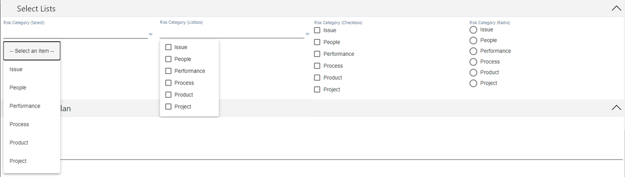
From Left to Right: Select, Listbox, Checkbox and Radio type Select Lists
See more on selection types and how to add them to Fields here.
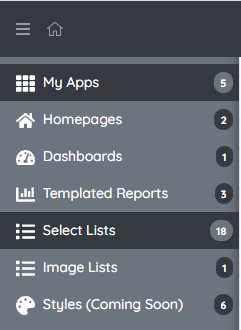
Accessing Select Lists via AppStudio
Naturally you must first be in the AppStudio side of your site (note this may not be something you have access to depending on your account permissions). Once here it is from the Home level of AppStudio that you will see 'Select Lists' on the left hand side. Clicking on this will take you to a list of all Selections for your site where you can then drill down into them and edit as desired.
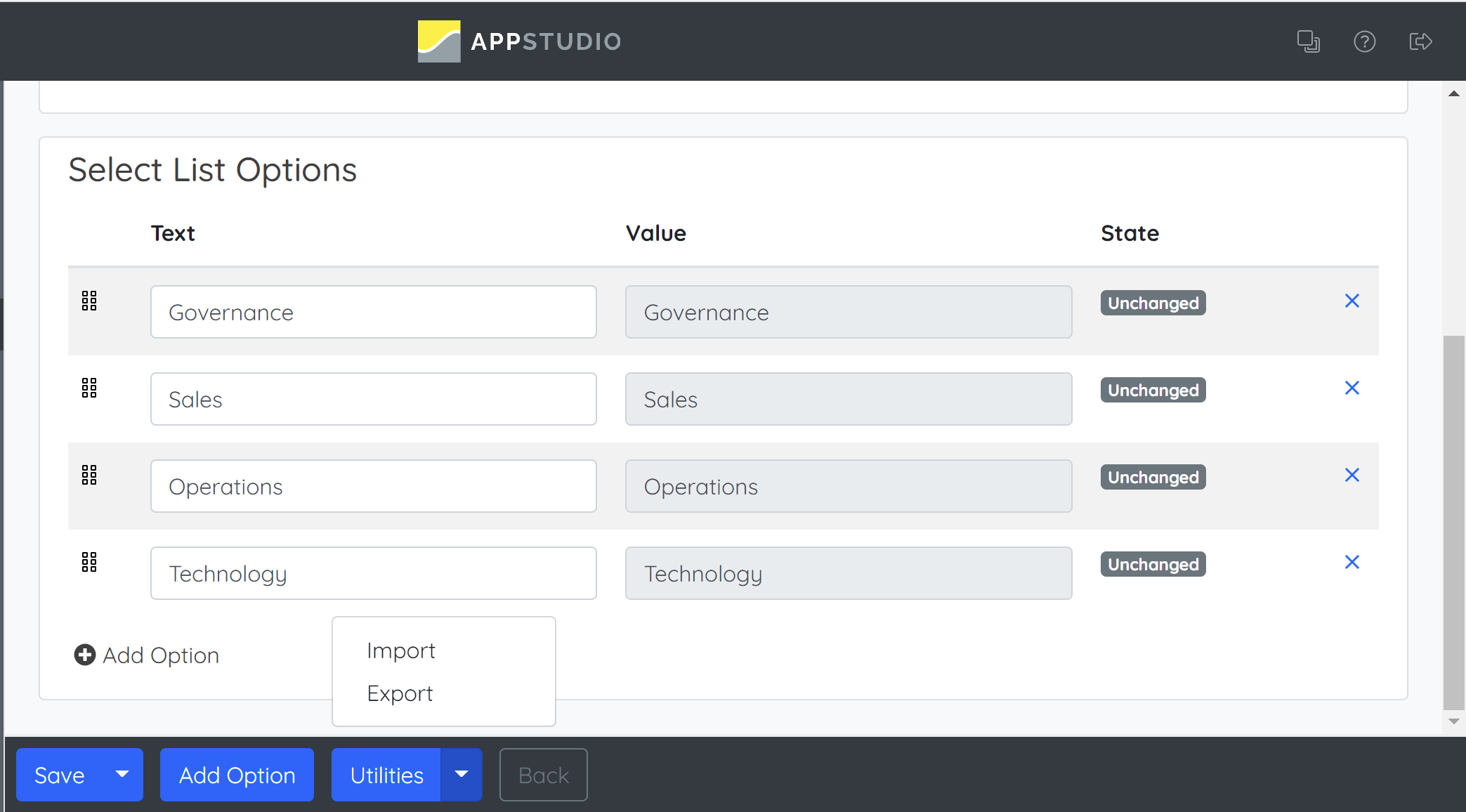
Adding the Selection Options
Managing Selections in AppStudio also allows you to Export/Import which can increase efficiency greatly for larger selections. - See here for more on this
On the Select List edit page you will be able to choose what values are assigned to the individual option Fields. Click on the '+' to add options, giving them each a 'Text' value and a 'Value' value as well as assigning a Display Order if desired.
Text: This is the friendly name for the option that will be shown to the User when they are inputting data on screen. It may also be used in Reporting as the friendly name for the selection made
Value: The value is what is stored against the Field in the database when the Text has been selected.
Note: In our example these are the same but it could be that they differ. One example would be if we wanted the User to score priority on a scale of 1 to 3 then the selection values could be 1, 2 & 3 but the Text against each could be the friendly name to the User of Low, Medium & High.
Display Order: The display order is the order that the selection options appear in. If no Display Order has been set then the options will be displayed alphabetically. To specify a Display Order assign each Selection option a numeric value. They will display first to last in the selection based on lowest number first.
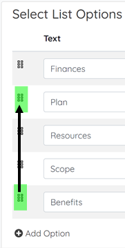
Display Order in AppStudio:
Use a drag and drop method as shown below by clicking and dragging the ordering tiles onto one another to order the Image Selection.
Note: Display Orders have to be whole integers. Therefore, it is good practice to assign Display Orders in multiples of 10 as this leaves room to add future options in specific places. This avoids the need to re-assign all Display Orders like if they are consecutive (1, 2, 3, 4 etc) as if I wanted to add an option between 2 and 3 I can't as 2.5 isn't a recognised Display Order value.
If you want to remove a selection item then this can be done by clicking on the cross on the right of the selection option.
Once you are happy with the Selection Options that you have added click on blank space inside your App to save the Selection List.
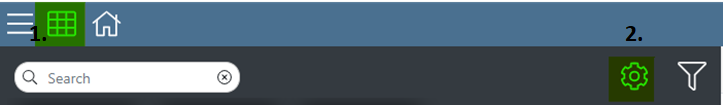
Accessing Select Lists via Settings
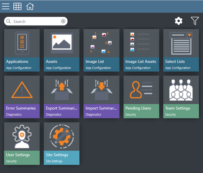
To view the Select Lists for a site, first go to the Launchpad and select the COG Menu. Then select the 'Select Lists' App from the selection below.
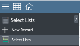
To edit the options in an existing Select List click the row it sits on in the list and click the '+' to add an option or the 'x' to remove an option. To create a new Select List, click on '+ New Record' below 'Select Lists'. If it is a new Select List then it MUST have an Identifier, a Name and at least one option.
Identifier: This is a value so that the system has a unique reference to the Selection Options you are creating.
Name: The name is how you will recognise the Select List for selection when assigning it to a Selection Field.
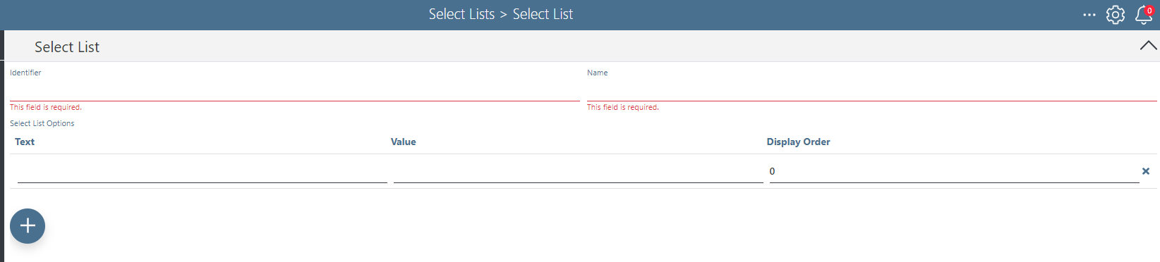
NOTE: Leaving any 'Required Fields' blank will prevent the creation of a new Select List.
Adding the Select List to a Field - Please refer here for how to configure a Selection into a Field
Having created the Selection Options, these can now be assigned to a Field. For the Field Type Selection, it will let you choose from the list of globally stored selection options.
Comments
0 comments
Article is closed for comments.