
The Geo Charting capability in the Map Report allows you to visualise data on a UK, Europe or World Map. This could be to show the total revenue streams from different Countries across Campaigns in a global organisation or to classify for a UK based supplier who the Operations Manager for each County in the UK is.
Please Note: This graph is not supported for Dashboard Reports.
Creating a Geography Field
The geography Field is a selection Field in the App that corresponds to the locations found in the Maps. Each of the Maps has a corresponding global Select List that can be chosen for the Selection Field created for the Map Report.
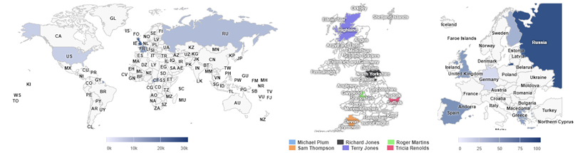
World Map (Global): This is a map showing all the continents of the World.
Europe Map (Global): This select list will allow assigning a European Country to a Record.
UK Map (Global): A list of all of the Counties in the UK
Map Configuration
Once you have created your Geography Field you will be able to build your Map Report. To generate a Area Chart, you first need to be in the 'Reports' section where you will then be able to click 'Add Report' in at least one of the highlighted locations below.
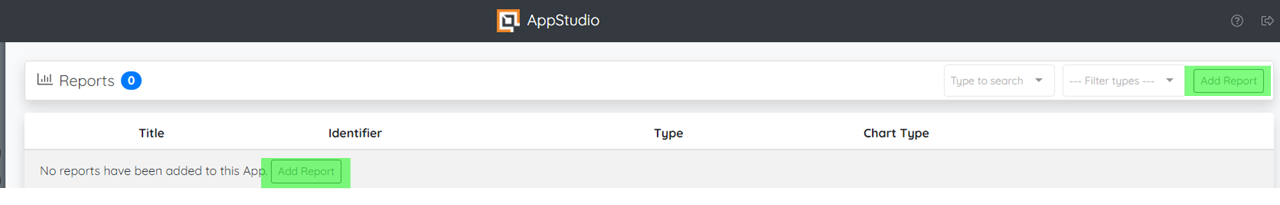
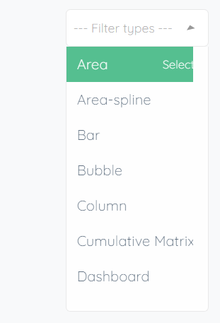
By clicking the button it should bring you onto a report selection page where you are shown various reports and some information about them. To choose a 'Map' find the card containing the 'Map' chart then click on 'Create'. Alternatively, you can find it by searching and selecting 'Map' on 'Filter Types'.

Consequently, this presents you with the Report configuration options below:
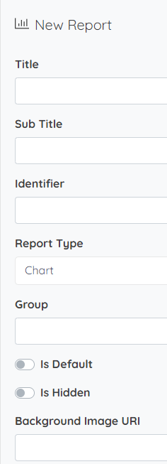
Title: The title is the reference to the Report that will appear in the App for the users. It will appear in the left pane menu for the and also in the breadcrumb (header bar) at the top of the page which tells the user where they are on the site.
Sub Title: The subtitle is a banner that appears at the top of the screen beneath the title that allows you to give a short description the report, this can be useful for keys and user audience.
Identifier: This should reflect the label. The identifier is a system ID for referencing a Report. This ID must be unique per Report and must contain only letters and numbers starting with a letter. It must also be a minimum of three characters.
Group: The Report Group is used if you need to group reports together. A Report Group will appear on the left pane, and once clicked, show the Reports in it below. They are collapsed when the App is first launched, and expandable as required.
Note: Report Groups will always display below non-grouped Reports.
Is Default: The default Report is the Report that the user will be directed to the first time that they open the App. If no default has been set then the user will be navigated to the Report with the lowest display order.
Note: Once a user navigates to a different Report, this preference will override the default option the next time they view the App if they haven't logged out in-between.
Is Hidden: This will hide the report from all users. It is commonly used whilst a Report is being reconfigured or if a Report needs to be removed temporarily to be reinstated at a later date.
Background Image URI: This option allows you to have an image behind the Chart by entering the image's Uniform Resource Identifier (URI). This generally is a character sequence identifying a resource, usually on the internet. In this context it identifies your chosen image which can be useful to indicate zones within the chart for instance, or simply for more tailored branding.
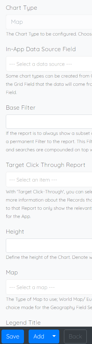
In-App Data Source Field: Some chart types can be created from Grid Field data to produce In-App Charts To select the Grid Field that the data will come from you can choose this as the In-App Data Source Field.
Base Filter: If the report is to always show a subset of Records, then the Base Filter can be used to apply a permanent Filter to the report. This Filter is always applied, and then user-defined filters and searches are compounded on top when the report is being used - For more about configuring base filters click here
Target Click Through Report: This allows you to direct the User to a chosen Report filtered down to the relevant Record(s) that relate to the location that the User clicks on
Map: The Map needs to match the choice made for the Geography Field Select List.
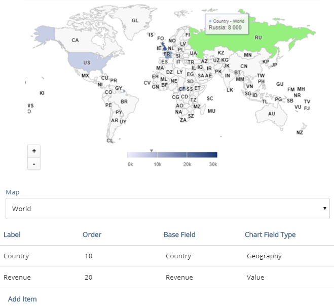
Chart Fields: The first Chart Field you configure will be the Geography Field. Add an appropriate label, display order then select the Field and set the Chart Field Type to Geography. Examples of this can be seen in the configurations below. Next you will need to choose from one of the following two options for the type of data that you are displaying as the second Chart Field.
Option 1 - Cumulative Numeric Value
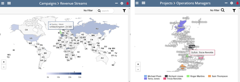
Choosing this options will allow you to show a numeric value for each location on the Map. The darker the shading the higher the value. If there are multiple Records in the App with the same location then this will aggregate the value to show the sum of the Field across all Records with that location. In our example we have chosen Revenue as our second Chart Field with the Chart Field Type Value. See the configuration below.
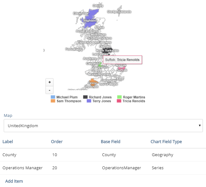
Option 2 - Display Text Value
This options will allow you to show a single text value per location. It makes the assumption that when the User is viewing the Report there is either one Record in the App per location or that there is one Record per location given the filter that has been applied when viewing the chart. In our example we have set the second Chart Field to be the Operations Manager with the Chart Field Type as Series displaying the name of the Operations Manager at each location.
If this chart doesn't give you the output your looking for please also check out our new Google Map chart if you get a chance - Click Here
Make sure to click the 'Save' button when making any changes in order for them to be added to the next app version. Once you have made all the changes you need to an application you are then ready to publish it to workspace.

Comments
0 comments
Article is closed for comments.